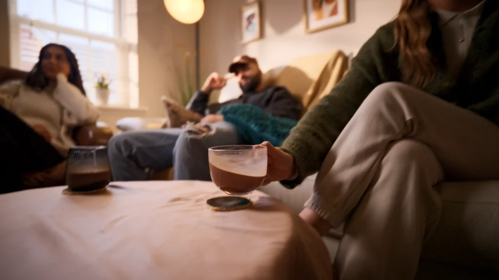
The Cookie Courier commercial tells a tale of two halves: a naturalistic, mundane beginning transitions to an explosion of flavour and visual delight. We’re introduced to a group of presumed friends, lounging in a living room, exuding boredom as they await the arrival of freshly baked, gooey cookies. This quiet, uneventful setup makes the subsequent visual and auditory burst of macro shots and crumbling ingredients feel even more striking.
The sound design for this commercial was pivotal in underscoring this contrast. For the introduction, we sought to create an atmosphere of hyper-boredom. This wasn’t just about conveying inactivity but amplifying the absence of stimulation. Here’s how we achieved this through meticulous sound design:
1. Detailed and Enhanced Foley to Emphasise the Quiet
In the absence of dialogue, every tiny sound becomes amplified. This was intentional:
- The delicate sip of coffee becomes pronounced.
- The subtle rustle of a leg tapping against the floor exudes impatience.
- Even the gentle adjustment of a hat gets its moment in the sonic spotlight.
Highlighting these usually imperceptible sounds created an exaggerated sense of stillness. The quiet wasn’t just silence; it was loud with details. This helped magnify the sense of a world lacking activity or excitement, pulling viewers into the slow, dragging moments of the characters’ wait.
2. The Musicality of Boredom
We chose to infuse a sense of musicality into this static atmosphere. At first glance, this might seem contradictory to the goal of “hyper-boredom.” However, the subtle rhythm added by the characters’ movements—synced with ambient ticks—blurred the lines between sound effects and music.
This rhythmic layer served two purposes:
- It gave the scene a subliminal sense of time and pacing.
- It mirrored the way boredom often has an underlying pulse, shaped by repetitive movements or thoughts (think: the hypnotic effect of a ticking clock which we’ll touch on soon).
This deliberate choice aligns with our ethos at Overtone: blending music and sound into cohesive storytelling.
3. Boredom Vocalisations: Setting the Scene
The opening sounds are key to establishing the mood: a yawn and a sigh.
- These vocalisations are not directly tied to on-screen actions; rather, they exist to establish the characters’ mood.
- While some might question the “accuracy” of adding sounds not visually supported by the footage, it’s a creative liberty we embraced. This is, after all, a commercial—a space where evocative sound design takes precedence over strict narrative fidelity.
These auditory cues immerse the audience in the palpable boredom of the characters, making their ennui almost contagious.
4. The Ticking Clock: Time Stands Still
Ah, the ticking clock—the quintessential symbol of waiting. While some might call it a cliché, clichés endure because they work. In this case, we gave the clock an exaggerated presence:
- The tick was heightened to four times its normal speed, subtly conveying restlessness and impatience.
- Its volume was set to dominate the room’s soundscape, reinforcing the sense of time dragging on.
This technique ties into a psychological phenomenon called the “stopped-clock illusion.” As neuroscientist Amelia Hunt explains, this effect occurs when the brain’s anticipatory mechanisms create a disconnect between expectation and reality, making time feel slower. It’s the perfect metaphor for the characters’ shared agony as they await their cookies.
“This deliberate choice aligns with our ethos at Overtone: blending music and sound into cohesive storytelling.”
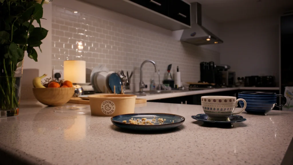
5. Vanilla Room Tone: A Sonic Blank Slate
Ambience, atmos or backgrounds, are often the unsung hero of sound design. It anchors the scene, setting the tone and subtly influencing the audience’s perception of time, place, and mood. For this commercial, we opted for a neutral room tone— to maintain the lifeless atmosphere.
- What we avoided: Any traces of life or activity outside the flat, like birds chirping, pedestrians chattering, or distant music. These would have introduced vitality, counteracting our desired effect.
- What we included: A balanced tone with low, mid, and high-frequency energy, creating a cohesive sense of space without drawing attention to itself.
This unobtrusive ambience glued the scene together, underscoring the dullness of the setting. The absence of external stimulation heightened the focus on the micro-details of the characters’ environment.
The Result: Boredom as an Art Form
By combining these elements, we successfully crafted a soundscape that exaggerated boredom to almost theatrical levels. This hyper-boredom served as the perfect foil to the dramatic shift that followed—a burst of flavour, sound, and excitement as the cookies made their grand entrance.
In commercials, sound design isn’t just about supporting the visuals; it’s about telling the story. Here, it wasn’t enough to show the characters waiting; we had to make the audience feel the wait, dragging them into the oppressive stillness of the room.
By the time the cookies arrived, the payoff wasn’t just visual—it was visceral.